Helping non-experts build custom PCs.
Anybody who has tried to build a custom gaming PC knows that it can be an overwhelming process.
This eCommerce app will let users research and purchase computer hardware in-app through third-party retail partners, which will help gamers or those seeking to upgrade or build a custom PC by minimizing the barrier of technical knowledge they need to make informed purchases.
Success for this app can be measured by sales conversions and user feedback.
Using Figma, I designed an app to make it easier and more fun to create a custom PC, even if you’re not an expert.
Figma Prototypes
Check out the high-fidelity prototypes I made in Figma by tapping one of the buttons below.
Part I: Project overview
The product:
*We’re trying to make the process of building the gaming PC of your dreams, component by component, as easy and accessible as possible.
Project duration:
We technically began working on this project in October 2024 for Google’s UX Design Professional Specialization Certificate program. We conducted multiple usability studies and iterated on the design multiple times. We finished this project in January 2025.
The problem:
Building a custom PC requires technical knowledge and expertise that not everyone has, making it a difficult and intimidating process for many.
The goal:
We want to make an eCommerce app that makes the process of building a PC as easy, accessible, and fun as it can be by allowing them to research and purchase computer hardware in-app through third-party retail partners.
My role(s):
Lead UX Designer, Lead UX Researcher, and Project Manager.
Challenges
The main challenges we faced during this process involved three major constraints: the scope and complexity of our design given our goals for the final product, lack of access to engineering expertise, and limited team size and resources for the project.
Scope and complexity of product’s design
Initially, as you will see below, we had big ideas about the value our app could deliver to users. We conceived a design that essentially had two core user flows instead of one. Over time, we learned through user feedback and our own experience that our ambitions were perhaps too great for the resources and constraints we were operating in; consequently, through multiple iterations, we reduced the complexity of our design so we could refine what we saw as our primary user flow instead.
Lack of engineering team
The nature of our product necessitates access to a product database of PC hardware components that link out to third-party vendors. Without an engineering team to help us advise on our design, we had to do our best to simulate such a database.
Limited team size and resources
We had a single team member creating, testing, and iterating on this design, and virtually no budget, which severely limited the scope of what we could do.
*note on the use of “We”
Use of the word “we” in this case study is primarily to align with best practices for UX design case studies, and to affirm the importance of working with a cross-collaborative team when designing a smooth and engaging experience that effectively addresses user needs.
Part II: Understanding The User
Competitive audit
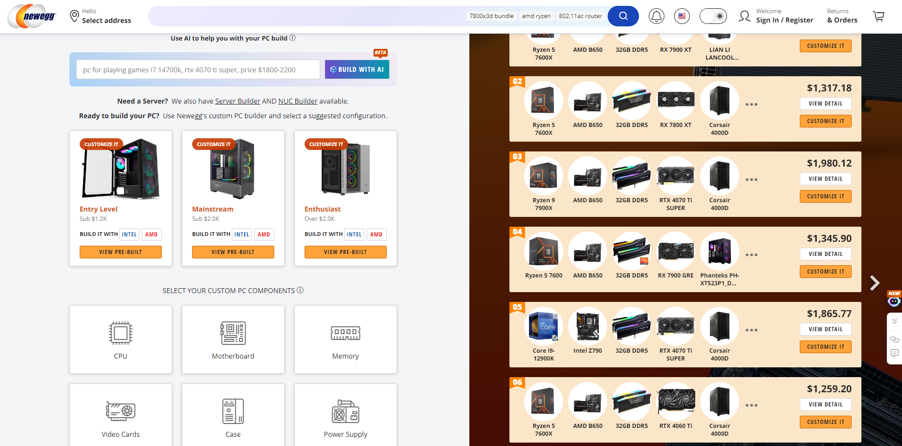
We researched our competition to gain insight about best practices for building platforms like the one we wanted to make by researching extant platforms — three direct and two indirect competitors, including Newegg.com (pictured left), PCbuilder.io, PCPartPicker.com, and even PCGamer.com’s content describing how to build a custom PC.
User Research
We consulted multiple individuals of various identities, backgrounds, and experience levels to design this product.
We also examined posts on social media platforms, such as Reddit, to gain insights about what pain points people seeking to build a custom PC experience.
User persona
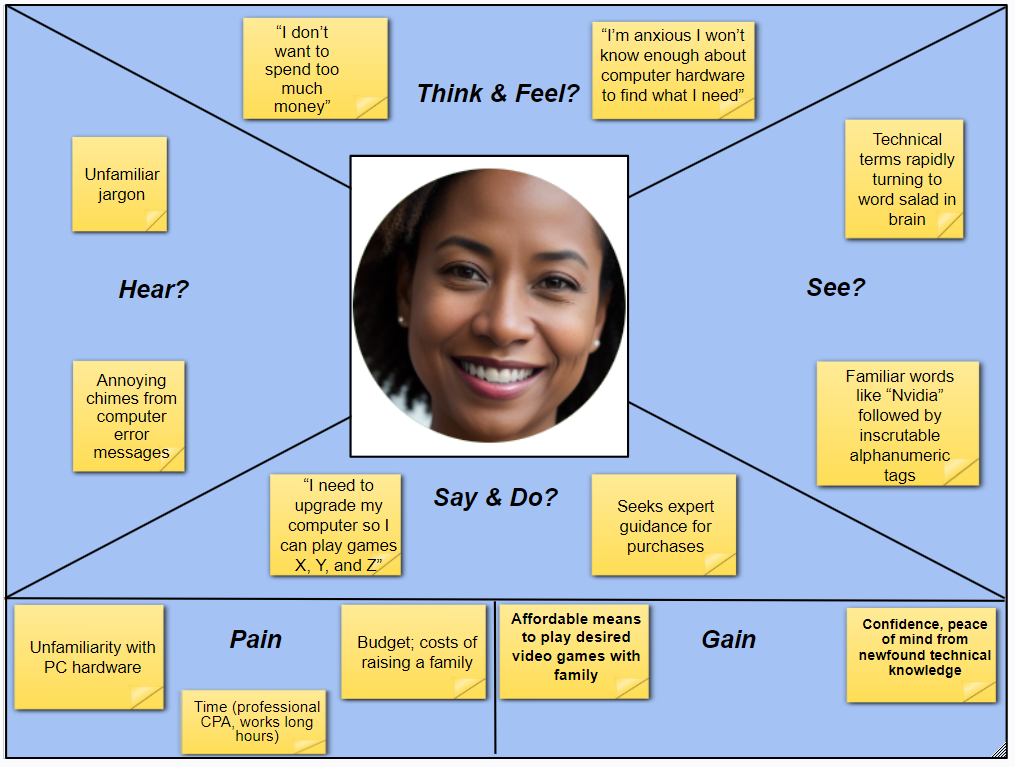
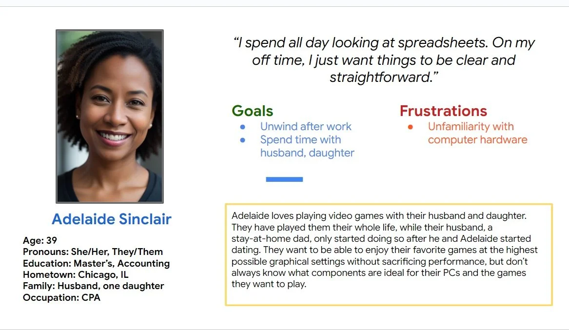
Through these processes, we were able to acquire crucial knowledge to create our user persona, Adelaide, which helped narrow our focus and dispel assumptions we had before conducting our research.
Adelaide is a busy, casual PC gamer on a budget who needs an easy, cost-effective way to upgrade their gaming PC to play the latest games because they lack technical knowledge about PC hardware and want to play the newest games.
User Journey
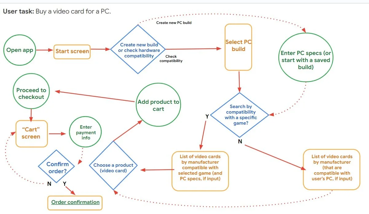
We started the project with one major user flow in mind: create a PC build, give the user the option to check its compatibility with a specific game, proceed to checkout components for the build.
Over time, we iterated this model significantly as we learned more about our users and received feedback about our design.
Early on, we added a second user flow — a function that would check the compatibility of our user’s PC builds for compatibility with the PC game of their choice.
This made our design exponentially more complicated, and we later iterated this flow out of our design (for now), choosing to focus on refining our primary user flow.
User Storyboard
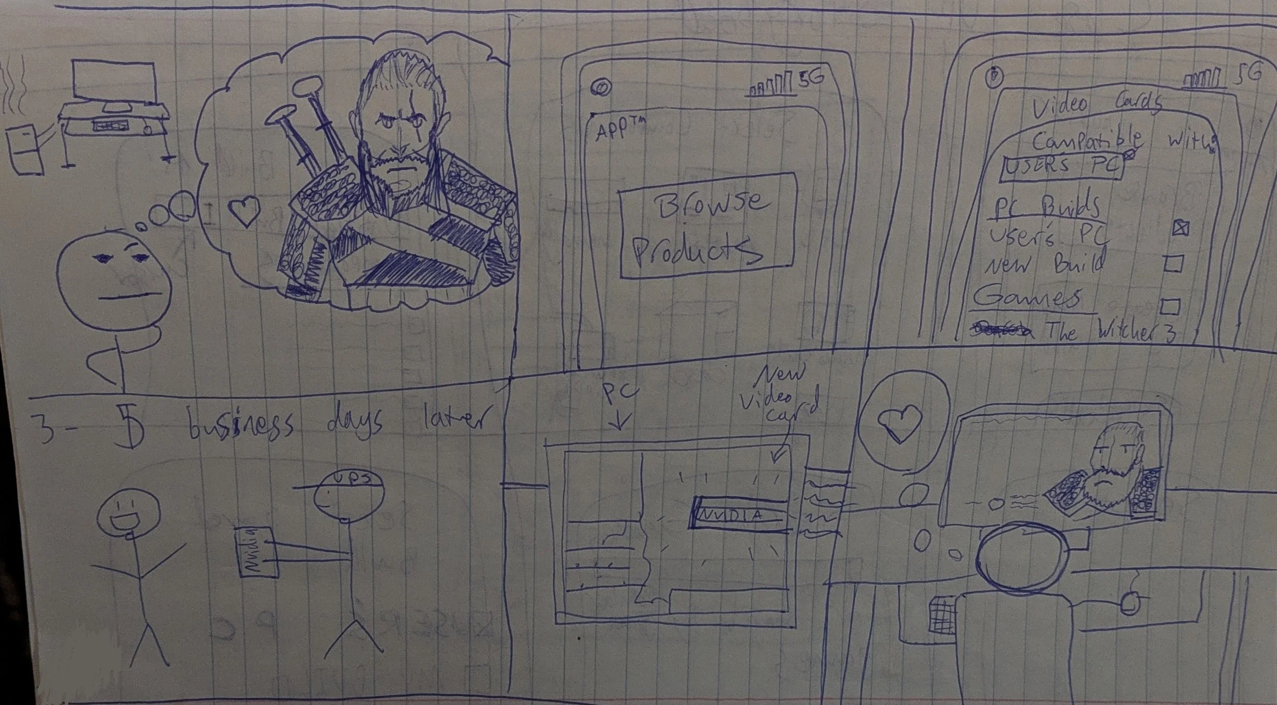
We created a six-panel user storyboard depicting our user to help conceptualize their experience with the product.
The story begins with our user dreaming of playing “The Witcher 3” on PC — a goal that, sadly, was out of reach due to their PC’s obsolete hardware.
Using our app, the user finds the hardware they need to upgrade their PC to meet the performance requirements of the game they want to play.
They then order the component through a trusted retail partner.
Within three to five business days, the part arrives at their home.
The user installs the component in their PC, and then installs the game.
With our help, they can finally join their beloved Geralt of Rivia on his adventures!
Usability studies
We conducted multiple usability studies with blocks of five participants, all of whom were based in the U.S.
In total, we conducted three usability studies for this project: one after completing our low-fidelity mockups, one to test our high-fidelity prototype, and one to test our responsive website and mobile page.
To gain more diverse data and accommodate the needs of our participants, we conducted these studies in both moderated and unmoderated (remote) environments. Each session with participants took approximately 10-20 minutes.
The results enabled us to synthesize key insights about what was and wasn’t working with our design — and gave us ideas for future iterations.
Key Insights
Point #1: “It’s popular for a reason.”
Users frequently asked for “popular” components and builds to be shown; this helped make our design more accessible by giving less experienced users an easy starting point. It also helped make the process less sensorially overwhelming, making the app more accessible to users with greater neurodiversity.
Point #2: “I don’t need it to be ‘fun,’ I need it to work.”
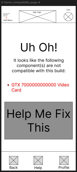
Although we want this app to be enjoyable to use, that shouldn’t get in the way of efficiency. We eliminated some features, including an error screen that we wrote to be tonally light-hearted — which our participants disliked.
Point #3: “Keep it simple.”
Participants in our usability studies consistently reported the same feedback regarding our design: “The fewer screens, the better.” This led to us significantly paring down the complexity of our design, including the number of screens users had to navigate through to complete tasks.
TL,DR; Don’t re-invent the wheel.
Photo credit: Jon Cartagena via Unsplash.
Part III: Prototyping
Paper wireframes
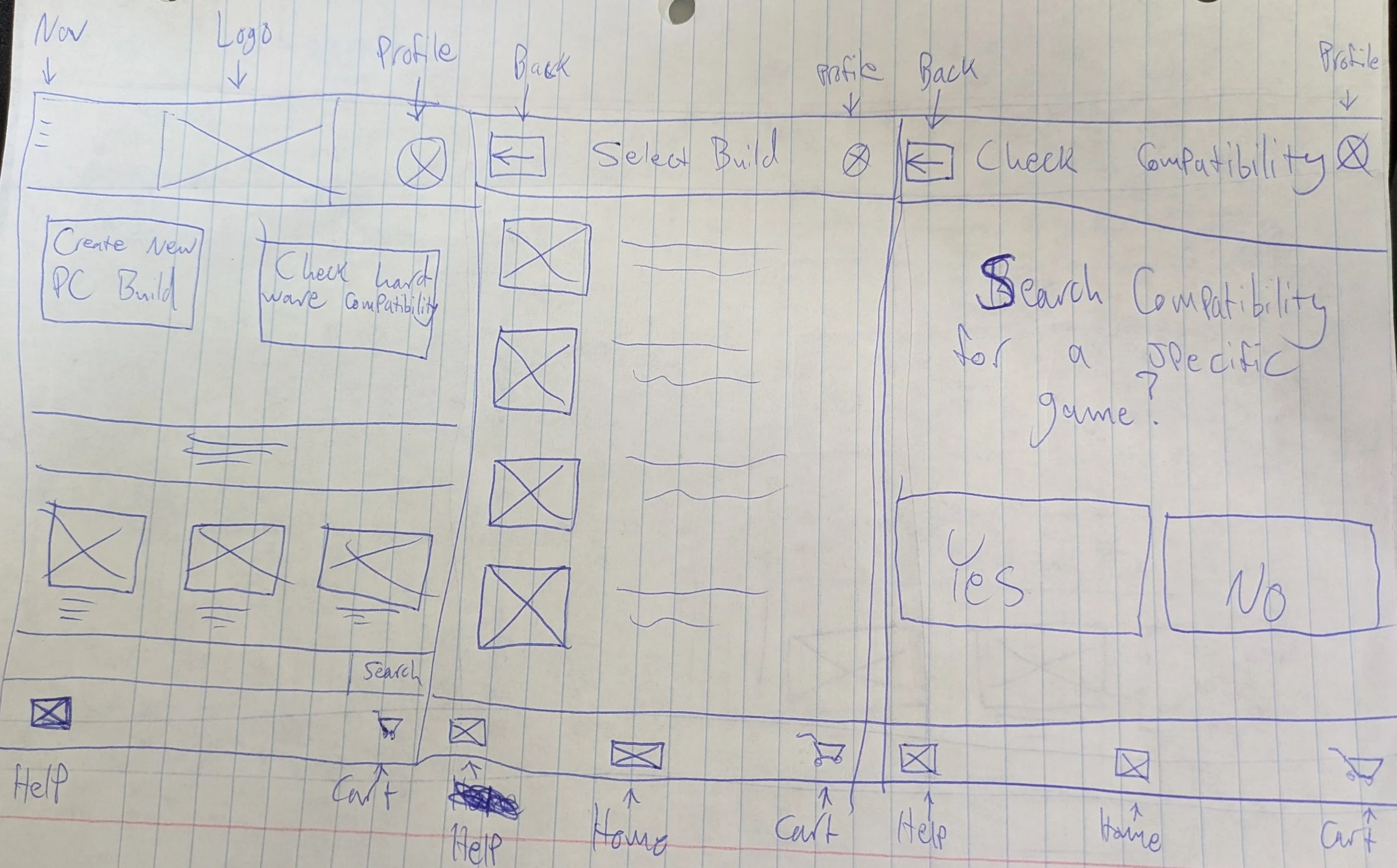
Early on, we knew we wanted to keep the layout as simple as possible. Utilizing gestalt principles (similarity, proximity, common region), we began drafting wireframes to create clear, easy-to-read layouts.
We also wanted to account for varying screen sizes from the beginning of our design process. Using design exercises like “Crazy Eights,” we brainstormed several different concepts before settling on the ones we liked most.
(Click or tap to scroll)
At every stage of design, we based our ideas on the assumption that the user would interact with our product on the smallest screen size available. This was due to suggestions from experienced UX designers, who explained that it is easier to scale up than down.
Digital Wireframes
Creating our mockups started out easy, though we eventually realized that our ambitions for the product’s design may have been too expansive to be practical for a one-person team.
This was the stage where we attempted to add a second user flow — a function that would allow users to compare the hardware specifications of their saved PC builds against the performance requirements of specific PC games.
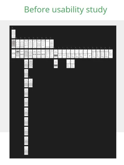
We later found ourselves staring at a mockup with over three dozen individual screens, including variants of other screens. Worse still, when we later built low-fidelity prototypes of this design from these mockups, our usability studies showed that users experienced much more difficulty than we expected.
Low-fidelity prototypes
As we refined our designs based on feedback from peers and our usability studies, we strove to make our product not just easy to use, but accessible to a wide range of users.
We found that offering choices between components, PC builds, etc. through “Popular” or “Based on Your Preferences” features helped make the process less overwhelming, more accessible to people with greater neurodiversity.
The importance of iterating
We also learned that users found certain features — such as the error message pictured left — to be less “cute” than we did; especially neurodiverse users who felt frustrated because it “slowed down” the flow.
We made accessibility concerns like these, as well as critiques that our UI on certain screens was too “overwhelming,” our top priority (P0).
It was here that we began to realize we needed to reconsider our design and reign in our ambitions.
While it was exciting to imagine a product that could both help users build the custom PC of their dreams while ensuring they could play their favorite games, simply building a low-fi mockup had taken much longer than it should have. Even worse, usability study participants had considerably more trouble with the game compatibility checker than the PC builder.
Although the former would eventually make it into the high-fidelity mockup stage, we realized that there were also high-level (P1, P0) concerns that needed to be addressed with our core user flow, the PC builder, and that it was more important to give ourselves the bandwidth to focus on addressing them before adding additional features.
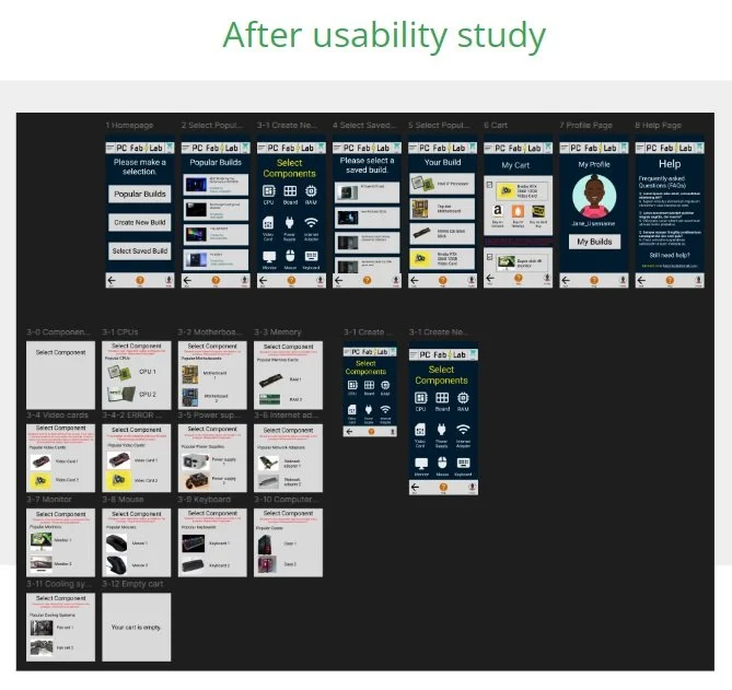
This led to a significantly leaner design than before — one that involved far fewer screens (see a comparison between our early Figma projects and our later iteration below).
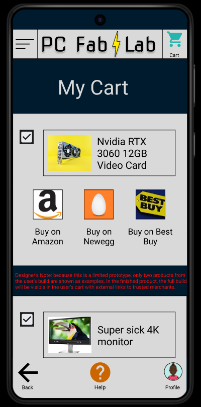
We also added “developers note” messages for users that explained, in detail, the parametric limitations of the prototype after multiple users suggested them between two different studies.
Finally, things were starting to come together.
High-fidelity mockups and prototypes
After significantly stripping down our designs, using overlays to help reduce the number of screens we would need, and even eliminating our second core user flow to focus on refining our primary features, we finally landed on a design that our usability study participants found much more engaging and easy to use.
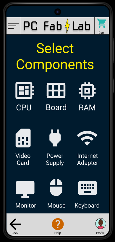
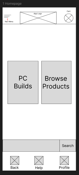
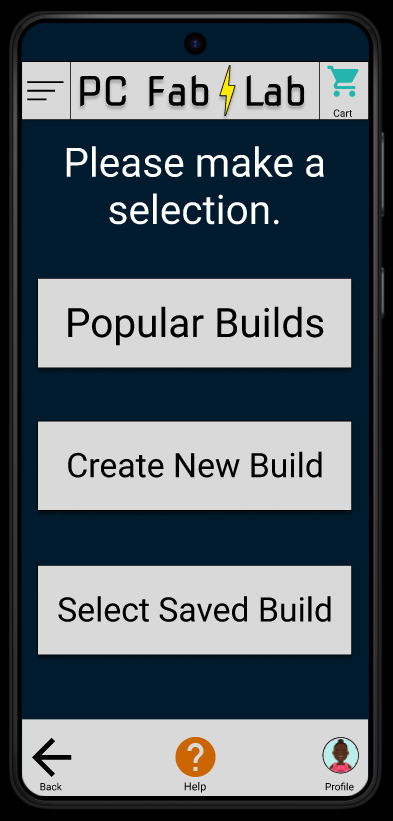
The user begins by choosing one of three options: selecting a premade build (from a list of “Popular” user builds, or from a list of the user’s saved builds), or creating a new build.
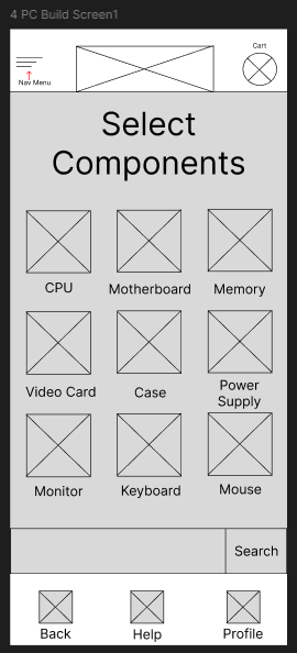
From there, the user is shown all the necessary components required to build a PC, a list of their own previously saved builds, or a list of pre-made, “Popular” builds vetted by users, depending on their selection.
To cut down on the number of screens we would need to mock up on the component select screen (pictured above), we used overlays that could be brought up by tapping on the icon.
Finally, users press a button to take them to their “Cart,” which lists all the components in their build. Each component includes a link to trusted ecommerce sites (Amazon, Newegg, Best Buy) that carry the component. From here, the user can compare prices and buy each component at the merchant that they prefer.
Accessibility considerations
Designing for accessibility was a priority for us since the inception of this project. To that extent, we implemented a number of features in our app’s design to improve its accessibility to those with challenges related to visual perception, fine motor skills, and sensory processing.
We referred to WCAG guidelines to help us achieve this.
Visual
We chose to base our color palette to create a visible, yet low-intensity visual scheme that would be accessible to people with colorblindness or similar visual disabilities while still being aesthetically pleasing and clear to as many users as possible. We also tried to avoid situations where discerning the difference between the colors of elements on the screen was the primary means of completing a task or goal for the user.
We also strove to limit the amount of text onscreen at any given time to 80 characters or fewer whenever possible, and to use the simplest, most concise language possible to achieve our goals.
Sensory
We wanted this product to be accessible to neurodiverse users, such as those with ADHD and ASD. This was one of the reasons we strove to keep both our visual and interactive design as simple as possible. We also strove to avoid layouts that may be sensorily overwhelming to some.
For example, this is why we strove to label as many interactive icons as possible — no matter how “universal” we assumed our icons would be to users — to help make the content in our design more adaptable to a wide range of users.
Fine motor function
Not everyone has the same capacity for fine motor functions. To the greatest extent of which we were capable, we wanted to keep our buttons and icons as large as possible without negatively impacting the design of each page, and far away from other interactable elements to make the app accessible for those with hand-eye coordination difficulties, uncontrollable shaking, or similar physical challenges.
Part IV: Outcomes
Feedback on our final prototype has been largely positive. Users have praised the simplicity of its design and ease of use, especially compared to earlier iterations. We’re proud of the product our hard work produced.
Whether you’re a gamer on a budget, a designer, a parent, or anything else, there are lots of reasons to build a custom PC.
We hope this design leads to the creation of a product that empowers consumers to access the tools they need within their while educating them about PC hardware.
User Feedback Highlights
“Pretty self-explanatory, easy to understand and use.”
“It feels accessible and easy to understand and easy to navigate.”
“I like how it offers multiple shop options for each component in my cart, making it easy to make the best price choices.”
“It looks easy and fun to use.”
Takeaways
Despite its challenges, designing an app is immensely rewarding.
Usability studies are invaluable. Test early, test often.
Start small, then iterate, iterate, and iterate again!
It’s easy to let your big ideas run away with you.
The elegance of a design lies in its simplicity.
Next steps
This was my first attempt to create a product using my UX design skills. I’m proud of what I accomplished, but I have no intention of stopping here! I have already begun working on new projects that I’m excited about, which I will add to my portfolio in time.
Let’s connect!
Thank you for reviewing my project!
If you would like to get in touch, you can contact me at mattraebel.chi@gmail.com, or reach out to me on LinkedIn.

