Cut through the noise.
Our educational app will let users research candidates in local elections, which will help members of the public by improving transparency around candidates and their platforms. Success can be measured by user engagement and feedback.
case Study: Civic Insight
It’s hard to stay informed. How do you know who to vote for when messaging around any candidate boils down to, “I’m the best,” or “my opponent is the worst?”
Enter Civic Insight, an app designed to help anyone and everyone engage stay informed about candidates in local, State, and Federal elections.
Figma prototype
Check out the high-fidelity prototype I made in Figma by tapping the button below!
Project Overview
The Product:
We’re trying to make it easier and more accessible for members of the public to quickly and easily research candidates that are up for election for local, State, and Federal offices.
Project duration:
I began this capstone project for Google’s UX Design Professional Specialization Certificate program in December 2024. Drawing on all I had learned during the course of this educational program, I completed it in January 2025.
The Problem:
Being an engaged democratic voter takes work. When it comes to voting, the lack of transparency around candidates’ policies, histories, and notable achievements makes researching them time-consuming and exhausting.
The Goal:
We want to make an app that helps voters quickly get a clear understanding of who—and what—they are voting for.
My role(s):
Lead UX Designer, Lead UX Researcher, and Project Manager.
Challenges:
There were two major challenges that we identified at the beginning of our project: avoiding bias and time constraints.
Avoiding bias
We realized while working on our paper wireframes for this project that avoiding political bias would be a major challenge due to the nature of the product. In our prototypes, we did not want to use language, iconography, typography, or any other visual cues to imply that one candidate was the “right” or “better” candidate. This was especially important because our goal is to empower voters to educate themselves about their candidates’ experience and qualifications, not which party they belong to.
To avoid this, we applied the following design decisions:
Since this product is aimed at a U.S.-based audience, we decided to avoid a blue and red color scheme to avoid evoking a “Democrat vs. Republican” visual scheme. Since the color blue is an accessible and widely-used color for design, we wanted to use blue for its calming psychological effect on users. We also wanted to use it for its comforting familiarity (due to its ubiquity in the designs of many popular apps); therefore, we chose a light blue, purple, and off-white color scheme.
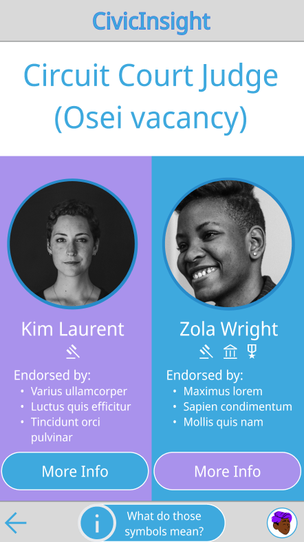
We included a system of iconography to help users see a high-level overview of each candidate’s civic, military, and professional experience - as well as the presence of any past controversies in their history - at a glance. After a lot of consideration, we decided to avoid including icons denoting the candidate’s party affiliation (if any).
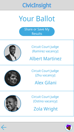
For our mockups and prototypes, we realized interactivity would have to be limited compared to the finished product, which meant we would have to “pick” candidates to be interact with. To avoid this, we designed our high-fidelity prototype around the election of judges for local municipalities, as these elections typically do not revolve around partisanship.
Time constraints
This project began at the beginning of the end of the Google’s UX Design Professional Specialization Certificate program; there were a lot of things to attend to around this project, including:
Finishing touches on PC Fab Lab and related case study
Updating this portfolio and beginning job search
Completing outstanding coursework
We knew our time would be more limited as we wouldn’t be able to focus one hundred percent on the project, as we had before. We also wanted to apply what we had learned from our previous previous project: was how to reign in our ambitions and set realistic goals for our design.
We strove even harder - and now, with more experience - to create a simple but effective design, leaning on all the skills and knowledge we had learned over the course of the certificate program.
Part I: Understanding the user
User research
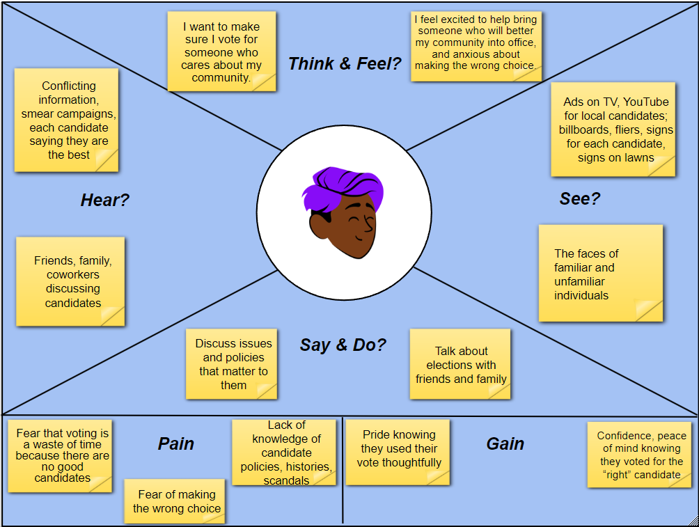
We consulted multiple individuals of various identities, backgrounds, and experience levels to design this product. We also examined posts on social media platforms, such as Reddit and Bluesky, to gain insights about what pain points engaged voters experience. Through these processes, we were able to acquire crucial knowledge to create our user persona, Paolo, which helped narrow our focus and dispel assumptions we had before conducting our research.
User persona
Paolo is a first-generation Brazilian-American citizen. They were politically active in their country of origin, and have carried their strong sense of civic responsibility with them to their new home. They want a way to clearly see which candidates’ backgrounds and platforms align with their own without spending hours reading about the careers of every single candidate. Ideally, they need such a solution to help them overcome language barriers for themself as well as family members.
User journey
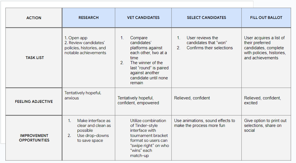
Unlike our first project, we had a better idea of how to keep my core design within a realistic scope. Once again, the priorities for this product from the start were accessibility and simplicity.
Early on, we started thinking about the designs of extant popular apps that could help us meet our user’s needs. We began thinking about a “bracket-style” format to help users narrow down one candidate out of several, in cases where there were more than two candidates. We also considered the “swipe” format of popular dating apps. We realized building on these ideas would be an effective way to address our user’s needs and meet our goals.
Usability studies
We conducted multiple usability studies with blocks of five participants, all of whom were based in the U.S. In total, we conducted two usability studies for this project: one after completing our low-fidelity mockups, and one to test our responsive website and mobile page.
To gain more diverse data and accommodate the needs of our participants, we conducted these studies in both moderated and unmoderated (remote) environments. Each session with participants took approximately 10-20 minutes.
The results enabled us to synthesize key insights about what was and wasn’t working with our design — and gave us ideas for future iterations.
Key Insights
Point #1: Say more with less
Some users complained that there was not enough space on the screen to fit all the text we would need to provide relevant info about each candidate. Others complained there was too much text on the screen.
Result: We opted to streamline each candidate’s profile by highlighting their experience at a high level first, providing the ability to learn more by visiting an expanded profile page, and using icons to convey highlights from their careers without words (we included a highly visible button on our UI to ensure users could easily access a page explaining each symbol).
Point #2: Save space
One of our users suggested leveraging pop-up overlays to help save space.
Result: This fed into our design of the expanded profiles and iconography, as referenced in Point #1.
Point #3: Language accessibility
One of our users pointed out that, especially for a U.S.-based audience like ours, the likelihood that people who do not speak English as a primary language would be using this app was high.
Result: We added a “Languages” page under the user’s “Profile” page that includes more than a dozen language selections to give non English-speaking people the ability to use our app.
Competitive audit
Although our design was inspired from the beginning by platforms with similar goals, we revisited multiple platforms like Ballotpedia and Injustice Watch, both of which we considered to be “direct” competitors for our product. This informed our design from the big picture down to small details.
For example, we decided to implement a system of symbols similar to Injustice Watch (pictured above) to give users a way to quickly see a short list of highlights from each candidate’s profile.
In other cases, we also learned important lessons about what not to do. We found some of Ballotpedia’s UI to be far too cluttered and difficult to navigate, so we used this insight to avoid making design decisions that created similar problems.
PART II: pROTOTYPING
wIREFRAMES
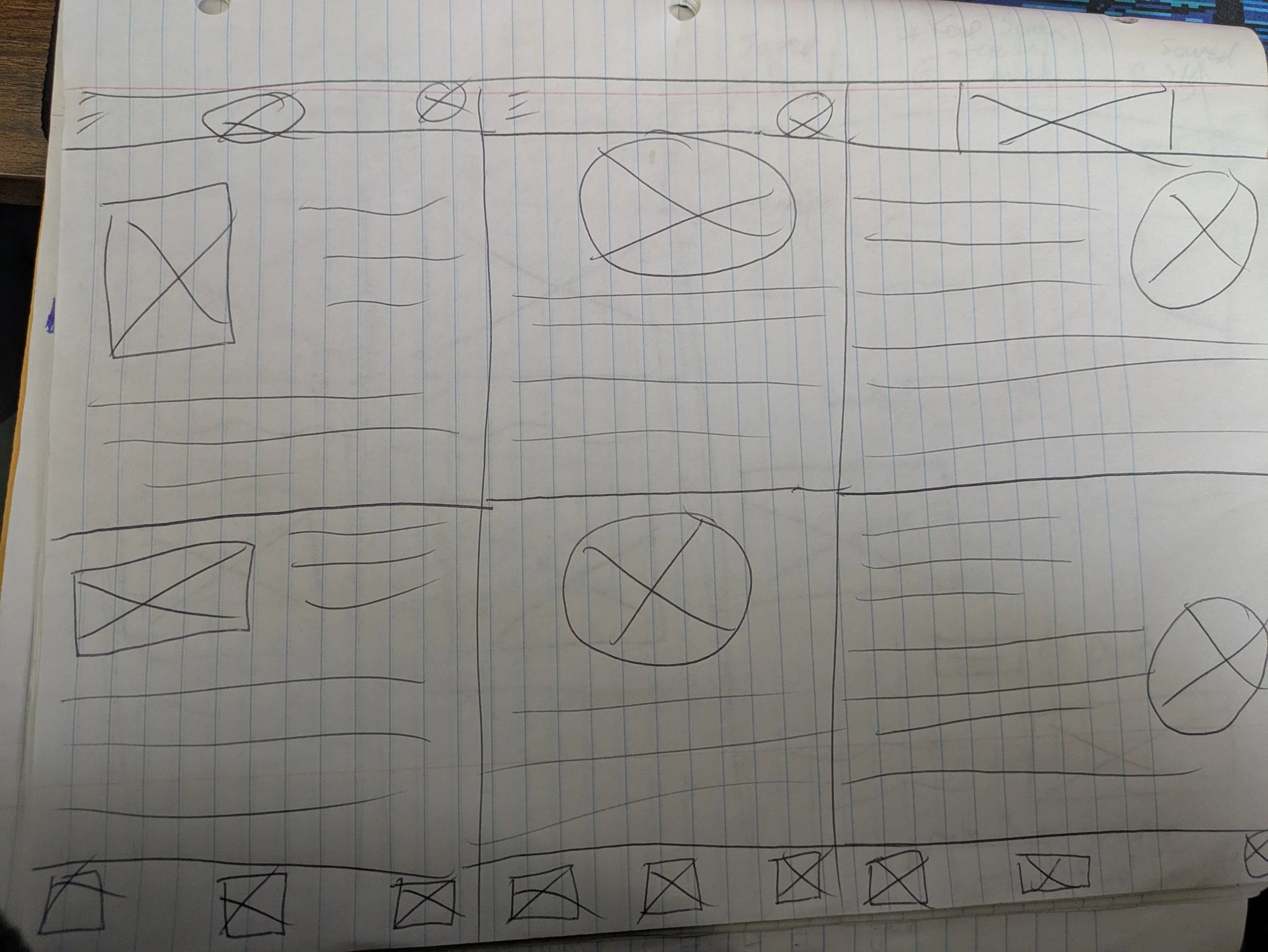
Based on our experience with similar products to the one we wanted to make as well as our competitive audit, we had a rough idea of the layout we wanted to use from the start. Using the “Crazy Eights” technique, we drafted multiple layouts for our product until we found one that fit with the features we wanted to create.
***Page currently under construction - check back later for more insight about the process of creating this design!

